Naturally Font Review: Authentic Web Typography
I was recently deep in the wireframing phase for a boutique skincare client’s rebrand when I hit that familiar design wall. The layout was clean, the photography was ethereal, and the user flow was logical, but the hero section felt sterile. It lacked the human touch that defines their handmade ethos. I needed a typeface that could bridge the gap between digital precision and organic warmth without sacrificing modern usability. That is when I decided to test Naturally, a stylish and light handwritten font from Script Amp, as the primary display typeface for the project.
Testing a script font in a live web environment is always a calculated risk. Unlike print design, where you have total control over ink spread and paper texture, web typography must perform across varying screen sizes, operating systems, and loading conditions. My experience integrating Naturally into this e-commerce build offered some genuine insights into how this premium font behaves when pushed beyond static mockups and into responsive digital product design.
Visual Personality in Digital Hero Sections
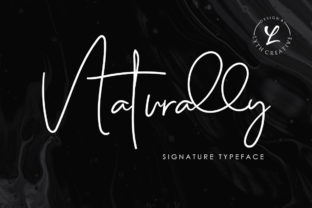
The first thing that stands out when you load Naturally into your CSS stack is its deceptively delicate weight. Many handwritten fonts designed for digital use are overly bold or chunky to ensure legibility on low-resolution screens. Naturally takes a different approach. It is unapologetically light, which gives it an airy, editorial quality that feels incredibly high-end on retina displays. When I applied it to the main headline—"Botanicals Crafted by Hand"—the thin strokes created a sense of luxury and calm that a heavy sans serif simply could not achieve.
The authenticity mentioned in the product description is not just marketing copy; it is visible in the glyph construction. The connections between letters do not look like algorithmic ligatures. They retain the slight imperfections and rhythm of actual handwriting. For my client’s landing page, this meant the brand voice immediately communicated "artisanal" before the user even processed the meaning of the words. However, because the font is so light, I had to be intentional about contrast. Testing revealed that Naturally needs significant breathing room and high-contrast backgrounds to sing. Placing it over a busy product photograph required a subtle dark overlay to maintain accessibility standards, whereas against a solid cream or white background, it performed beautifully without any visual aids.
Bold Swashes as Functional UI Elements
One of the most practical features of Naturally for web designers is the inclusion of bold swashes. In traditional print design, swashes are often purely decorative flourishes reserved for wedding invitations or book covers. In web design, however, they serve a functional purpose within the visual hierarchy. During the site build, I utilized these extended swashes not just as ornaments, but as directional cues.
For example, on the "Shop Collection" section, I used a swash variant underneath the category titles to create a natural underline effect that felt integrated rather than added via CSS border properties. This small detail elevated the perceived quality of the interface. It turned standard navigation elements into branded moments. The swashes also proved useful for breaking up grid monotony on the blog index page, allowing headlines to overlap slightly with image cards in a way that felt intentional and dynamic. Just be mindful of your container widths; those expressive tails can easily get clipped on mobile viewports if you do not adjust your padding or switch to alternate glyphs at smaller breakpoints.
Responsive Performance and Readability Constraints
While Naturally excels as a display font, it requires strict discipline regarding scale and application. As a UI designer, I cannot stress enough that this is not a body copy font. I tested it briefly at 18px for introductory paragraphs, and the results were poor. The light weight disappears on non-retina laptop screens, and the cursive connectivity makes rapid scanning difficult for users. Accessibility should always be paramount in web design, so I relegated Naturally strictly to H1 and H2 tags above 3rem, ensuring it remained a stylistic accent rather than a readability barrier.
Mobile responsiveness presented another learning curve. On desktop, the flowing nature of the font allows for long, elegant phrases. On a 375px mobile screen, those same phrases wrap awkwardly, breaking words in unnatural places. I found that Naturally works best on mobile when the copy is concise—three to five words maximum per line. For the mobile hero section, I actually swapped to a simpler alternate version of the header text to prevent the swashes from pushing content below the fold. This highlights a crucial workflow tip: always preview your font choices in a browser inspector at multiple widths before finalizing your design system. What looks spacious on a 27-inch monitor can feel claustrophobic on a phone.
Strategic Font Pairing for Brand Identity
To make Naturally work effectively in a commercial web environment, pairing is everything. Because the font carries so much personality and texture, it demands a grounding partner. For this project, I paired it with a geometric sans serif font for all body text, buttons, and navigation labels. The mathematical precision of the sans serif provided the necessary stability that allowed Naturally’s organic forms to shine without making the entire site feel unstable.
I also experimented with pairing it alongside a classic serif font for subheadings and pull quotes. This combination leaned heavily into an editorial aesthetic, perfect for the brand’s journal section. If you are designing for a more playful or youthful brand, a rounded sans serif might complement the softness of Naturally better. However, avoid pairing it with other scripts or highly decorative display fonts. The visual competition creates cognitive load and dilutes the impact of both typefaces. Let Naturally be the singular voice of emotion in your typographic hierarchy, supported by utilitarian workhorse fonts that handle the heavy lifting of information delivery.
Licensing and Technical Implementation for Designers
Before committing Naturally to a client project or your own digital product, verify the technical and legal parameters. As with most premium fonts from Script Amp, checking the specific webfont licensing tier is essential. Desktop licenses typically do not cover @font-face usage, and traffic-based tiers vary significantly. Ensure your license covers the projected monthly pageviews for the site to avoid compliance issues down the road.
From a technical standpoint, pay attention to file formats and loading performance. Naturally includes OpenType features like alternates and ligatures that are vital for avoiding repetitive letterforms in headers. Make sure your CSS utilizes font-feature-settings to access these glyphs programmatically. Also, consider using WOFF2 format exclusively for modern browsers to keep load times snappy. Since this is a decorative font, users should never wait for a massive font file to render basic content. Implement proper fallback stacks so that if Naturally fails to load, the user sees a readable cursive or serif alternative rather than a broken layout.
- Best Use Cases: Hero headlines, signature logos, limited-time offer banners, testimonial signatures, and editorial accents.
- Avoid Using For: Navigation menus, form inputs, dense body copy, footer links, and critical accessibility text.
- Technical Tip: Always enable kerning and standard ligatures in your CSS to maintain the authentic handwritten flow.
- Accessibility Note: Maintain a minimum contrast ratio of 4.5:1, which may require darkening the font color due to its light weight.
Integrating Naturally into a web project is a rewarding exercise in balancing aesthetics with usability. It brings a level of bespoke charm that generic system fonts cannot replicate, helping digital brands establish an emotional connection with visitors instantly. By respecting its limitations regarding size and contrast, and leveraging its beautiful swashes as structural design elements, you can transform a standard website layout into a cohesive brand experience that feels genuinely handcrafted. It is a powerful tool in the modern web designer’s arsenal, provided it is wielded with intention and care.